Nonprofit websites are fundamentally different than their business counterparts. They are multifaceted and serve many different purposes from donation to events’ calendars and even to volunteer information and program resources. With this in mind, however, the anatomy of a nonprofit’s homepage and plethora of interior pages are going to look completely different from that of a traditional website.

We at Elevation have been designing and developing nonprofit websites for over 10 years so we are well versed in the unique features of these sites. We thought it was high-time we shared this knowledge, so we are excited to be launching a three-part series where we break down the most important nonprofit website pages. It’s only right that we start with the homepage so let’s dive right in!
Did you know that the average website user only spends about seven seconds evaluating your site? That means you have very limited time to really pack a punch. You want to send a message about what your organization is and what you stand for that resonates in those initial seconds and here’s the catch, do it with as little text as possible. Instead, using powerful, high-quality imagery is the way to go.
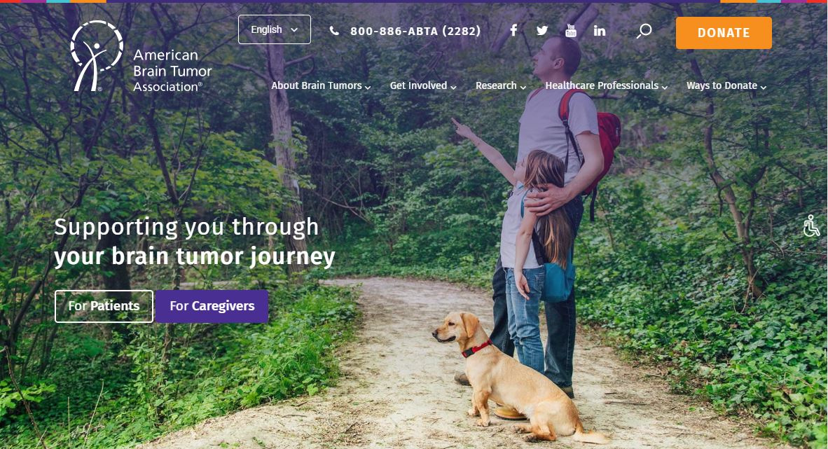
Take the American Brain Tumor Association’s homepage. This organization hits the mark with their choice of image, something both relatable and high quality. ABTA’s first impression includes all of the essential elements required for a nonprofit homepage.
CTAs (calls-to-action) are places throughout the homepage inviting the relevant user to click the right button. The “donate button” is especially prominent and lives in the upper right corner where most are accustomed to finding it.
The navigation menu is both clean and easy to use allowing for pleasant navigation. Above the menu features language changing options indicating that ABTA thought about different user groups (and language speakers) throughout the design of the homepage.
The site also offers social media sharing options, another best nonprofit website practice, as well as a search function to help those looking for specific information.
Overall the design and careful branding of the homepage allow it to leave its mark on the website user without it being overwhelming or overdone. Their logo is correctly placed in the upper left of the page and they use a colored filter that fits their brand standards.
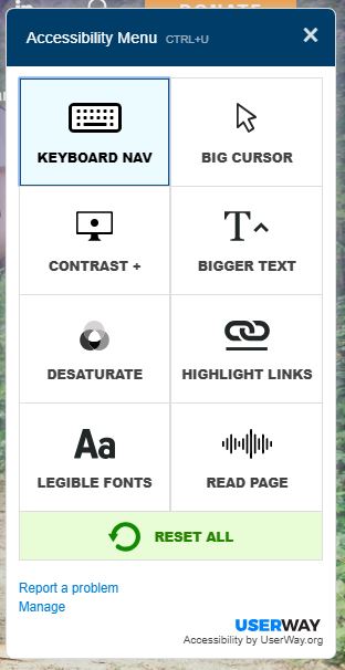
Another aspect of this homepage that makes it top notch is its accessibility feature. If you look back to the first image you’ll notice an icon of someone in a wheelchair. When that icon is clicked, this accessibility menu (shown above) appears. This menu features a ton of different options that make the site navigable by anyone.
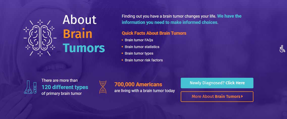
ABTA explains the problem that their organization addresses in their “About Brain Tumors” section. This is an example of really well laid out content. The homepage flows from the initial image to the issue topic. In terms of design, ABTA includes wonderful CTAs and again high-quality imagery with a well-branded filter over it.
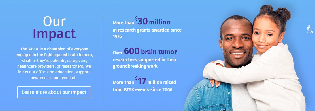
ABTA also uses their homepage to highlight the impact their organization has. Again, this is an example of well thought out content. Going from issue area to organization impact tells their nonprofit’s story and importance throughout the homepage. The carefully thought out content placement is essential.
They do so again through high-quality imagery and carefully placed text. They highlight the important numbers and information through the changing of size and text color. Again, this homepage section remains well branded with CTA “learn more about our impact” guiding the user to more information if necessary.
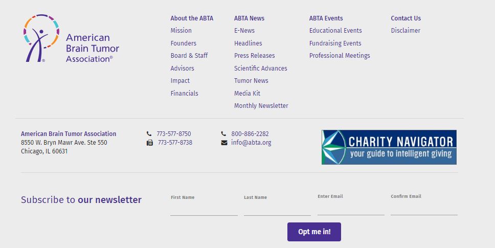
The final essential element of a nonprofit homepage is the footer. The footer should always contain your nonprofit’s address to boost credibility. In addition, they give options for newsletter subscription which means they are using their homepage to build their email lists as well. As with any good homepage, there have their sitemap laid out in the bottom allowing for easy navigation.
There you have it, the anatomy of an awesome nonprofit homepage! If you have any questions about how it came together or how to do it with your nonprofit’s site, drop us a line and stay tuned for next week when we break down a donation page!
Continue the Series…
Anatomy of a Nonprofit’s “About Us” Page
Anatomy of a Nonprofit Website’s Interior Page
Anatomy of a Nonprofit’s Donation Page