In the second piece of our three-part “anatomy of” series, we are going to talk donation pages and overall donation experience. I know that a lot of your are hanging off the end of your seat in order to learn about what makes the “perfect donation” experience that gets your organization more dollar bills. Here’s the thing, the nicest and most effective donation experiences do involve the creation of custom (added cost) pages. However, we are here to tell you that those pages are worth it. Thinking of your internal donation pages as an investment will seriously make all the difference. So what goes into a “donation experience”? Once again, we got you.

Online donation never starts on the actual donation page. It begins on your homepage or perhaps other landing pages. This is why having an ever-present banner that contains a donate button in a bright color is essential. Maybe your site visitor is browsing your “impact page” and is inspired by all that you do and then makes the decision to donate. Don’t make it hard for them, have that donate button in the upper right corner where they’re expecting it!
Best UX practice always keeps your visitor within your website as opposed to linking out to an external one. We recommend including both a PayPal and credit card donate option for this reason. That way you are following best UX practices while still giving those an option to donate with PayPal if they already have account information saved there.
Think carefully about your form fields and don’t overwhelm your donor. There is nothing less appealing than a long form that feels like a job application. Keep it short and relevant and break it up when at all possible so that it doesn’t feel quite as tedious and becomes more interactive.
Use imagery on your donation page that puts your donor at ease. You want to assure them that the donation going to your organization is really going to make a difference.
We recommend getting rid of your navigation menu at this point. You want to signal to your user that a different action is to be completed on this page than all other pages and you don’t want them to click away.
Finally, always include a thank you page and make sure an email receipt is generated. You are always working to build credibility and making your donor feel appreciated and safe.
Let’s look at a real life example from Dreamscape Foundation, an organization that works to provide opportunities and support for those living with disabilities.
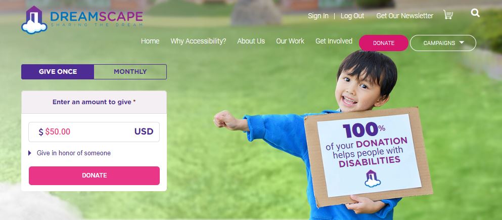
After clicking “donate” on Dreamscape’s site you are taken to their donation page. They made an organizational decision to keep their navigation menu accessible throughout their donation experience.
You will see that they give the donor the option to give once or monthly, showing that they are thinking about donation ease. They have also separated their form and have one field show at a time making it both interactive and nice to look at! They use an image that indicates to the donor that their donation is going to the right place.
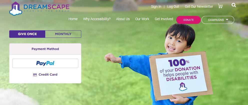
After entering in the donation amount, the user is taken to the next form field which gives them the option of PayPal or credit card (A+)!
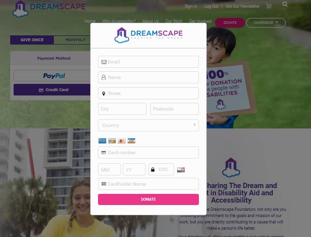
Above shows the credit card form section, the longest stretch of form in the entire process. However, the fields have been optimized to only ask for what’s needed.

After your donation is complete, a thank-you page appears and you receive an email receipt.
This is what a “donation experience” looks like. The “anatomy’ of the page is a little more complicated than a single internal page, but it should be! This is a page well worth investing in, so that donors will invest in your organization.
Continue the Series…
Anatomy of a Nonprofit’s Home Page
Anatomy of a Nonprofit’s “About Us” Page
Anatomy of a Nonprofit Website’s Interior Pages