Gone are the days when nonprofits didn’t have to worry about web design and upcoming web trends. However, in today’s increasingly technology-based world, nonprofit organizations must invest time and resources into building websites that inspire and spark change.
We’ve put together our list of the best nonprofit websites out there on the world wide web. We’ve included a short description of each to explain some of the ways these nonprofits are winning in web design. We’ll highlight some of the giants in the industry (charity:water, Invisible Children, etc), while also naming a few small-medium sized nonprofits that have also excelled in web design. Also check out some awesome membership website examples.
Learn from the pros and start creating a web design strategy for your nonprofit, today!
Charity:water
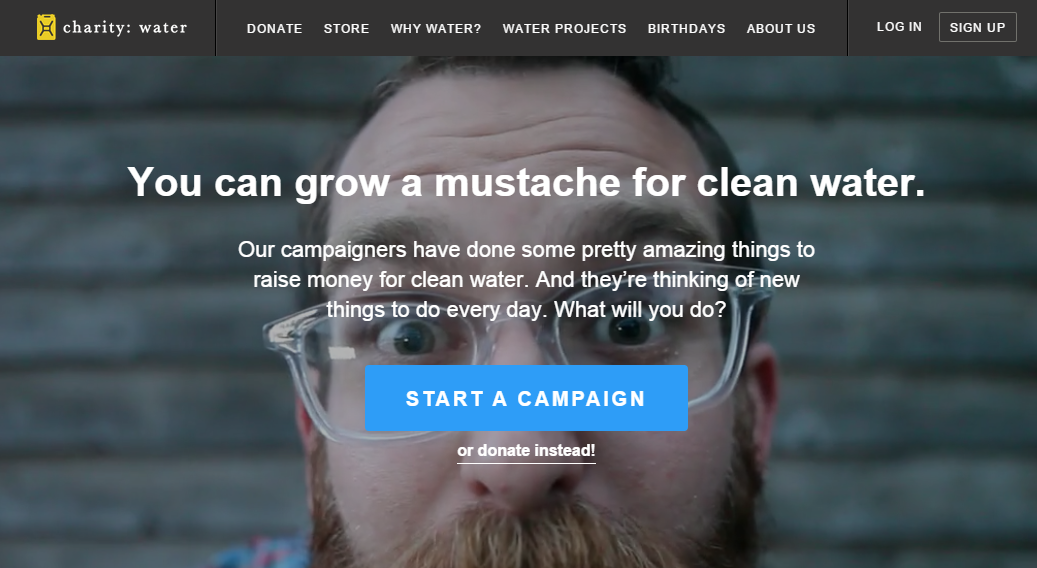
- Charity:water featured photos can best be described as charasmatic. They engaging and empathetic showing how every individual can take action to raise money for clean water.
- CTAs are well-displayed. Notice, in the above image there are 3 CTAs, but they are not overwhelming thanks to strategic choice of fonts size, color, and position.
- Mobile-friendly – All graphics, text, CTAs, links transfer perfectly from desktop to mobile-device.
Invisible Children
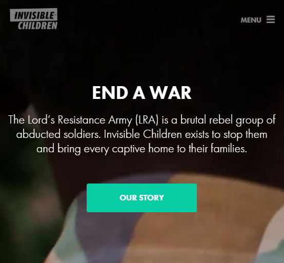
- Compelling imagery and videos that inspire and effectively communicate the mission of IC.
- Mobile-Friendly – IC’s photos, videos, and text are extremely powerful, therefore, it’s important that when viewed on a mobile-device, these images and videos continue to be impressionable.
- Whitespace that guides the reader’s eye to the most important part of the web page, the CTA.
Generation Ubuntu
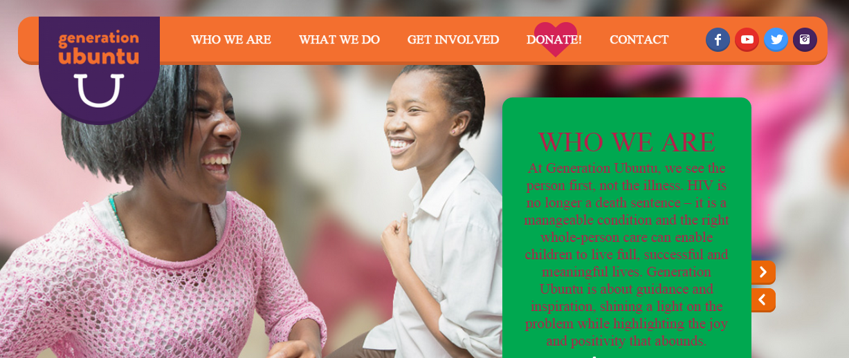
- Compelling images that are inspirational and reflective of the organization.
- Clear mission statement posted on the homepage that is easy to read and access further information.
- Responsive – All images and text transfer to a variety of desktop and mobile-device sizes.
NPR
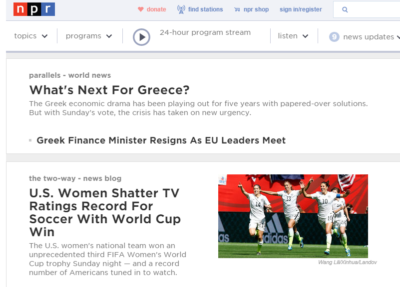
- Excellent organization of text – NPR generally uses more text than most web designers would recommend, but their strategic use of whitespace, images, font sizes, and bolded words allows the eye to easily maneuver the site.
- Easy scroll and user-experience – Nothing is hidden or unclear.
- Excellent navigation – Podcasts and articles are organized and separated allowing viewers to navigate the site efficiently.
Root 66 Garden
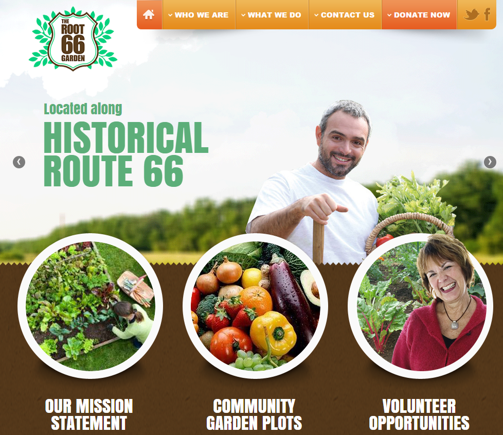
- Excellent use of icons so viewers can easily access further information and opportunities to volunteer and support the organization.
- Imagery and text is balanced. Neither is too overwhelming or distracting.
- The site is extremely user-friendly. Icons, CTAs, and links encourage viewers to engage with the page.
Oxfam America
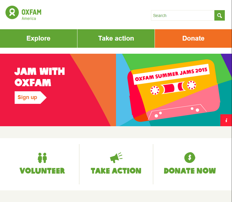
- 3 Calls to Action – Explore, Take Action, and Donate – that are displayed as the main focus of the homepage.
- Show impact – Oxfam provides viewers with statistics of exactly how they are helping.
- Provide donation amounts for supporters to choose from. This has become an increasingly popular strategy for nonprofits because viewers are more likely to donate when they are given options.
National Coalition Against Domestic Violence – NCADV
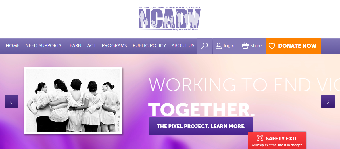
- Audience focused – All content is centered on helping women who have experienced/are experiencing domestic violence. Safe exit buttons, links, and easy icons are placed throughout the website to reach out and engage their audience.
- Easy to use icons that encourage viewers to learn more about the various resources NCADV offers.
- Transparent – The site provides real life examples of women that have suffered from domestic violence.
Girl Effect
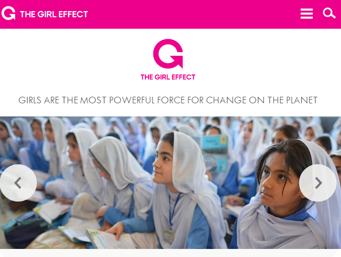
- Simple landing page that explains the mission and invites people to take action.
- Easy scroll-through and user-friendly experience to access more information.
- Excellent use of infographics to relay statistic-heavy information and encourage viewers to support.
Syrian Sunrise Foundation

- Show impact – Give donors a step-by step rundown of where their donations will be allocated.
- Compelling imagery and text – Slideshow that highlights different areas of their mission.
- Easy to follow and share their story on social media.
Community Education Alliance
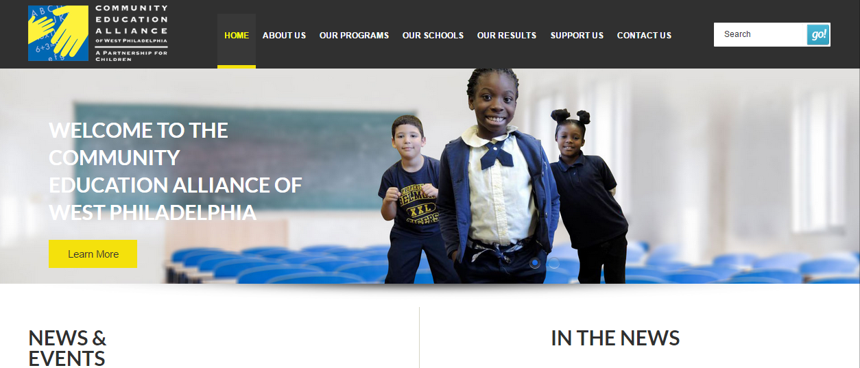
- Consistent color scheme that is maintained throughout the entire site
- Clear CTAs that don’t overwhelm viewers, but encourage people to learn more, take action, and donate.
- Compelling imagery and text that clearly communicates their message and encourages their audience to engage.
Conclusion
Okay, so maybe this isn’t the definitive list of best nonprofit websites. There are hundreds that would fit into our ranking, this is just a snapshot into some of our favorite picks. Some were even created by our design team here at Elevation! Check out more of our work and if you’re interested in designing a website for your nonprofit, contact us and one of our experts will be in touch!
What other nonprofits would you add to our list?