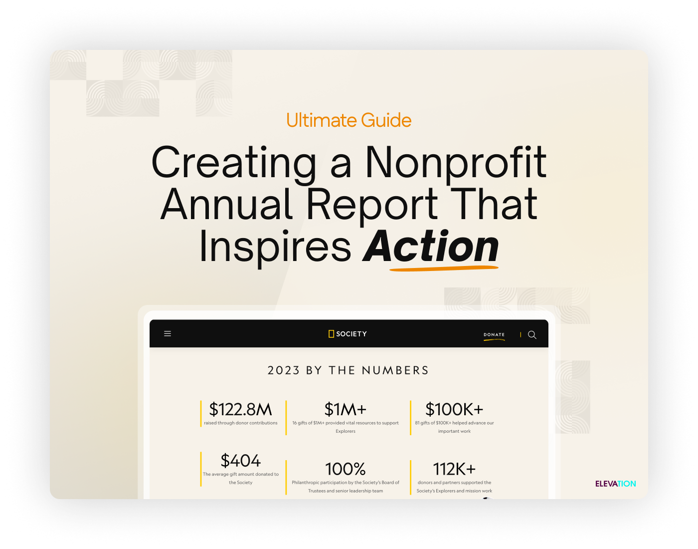
As today’s websites continue to heighten the standard for good design, peoples’ expectations of your own site and campaign pages are raised just as high. It’s essential for your organization to not only meet this new standard of excellence, but to truly “wow” your supporters with well-designed materials.
Your design should make it easy for visitors to learn more about your cause, offer options to become more involved with your organization, and—above all else—donate quickly.
Below, we’ll walk through how good design can help you grab visitors’ attention, build trust with your audience, and ultimately lead to more donations.
What Is Good Design?
At its core, good design is the union of multiple elements that come together on the page to create something greater than the sum of their parts. It encompasses everything from font and color selection, all the way to page hierarchy and calls to action.
Visual aesthetic plays a big part in defining good design. However, it isn’t the end-all-be-all of what makes something good or bad.
Good design strengthens your business. For nonprofits, good design attracts new supporters, elicits more donations, and encourages action from your community.
To help ensure your design accomplishes this and remains purpose-driven , always ask the following questions:
- What do you need to design?
- Why do you need to design it?
- Is it part of a specific campaign or initiative?
- What do you want this design to accomplish?
If you want your design efforts to drive donations, you have to know the purpose behind it.
Beyond Aesthetic
Traditionally in the nonprofit space, design is an afterthought. It’s often seen as a tool that makes something look pretty, and for most that’s where the conversation stops.
When designing a page, you have to go deeper than the surface aesthetic and consider how people will interact with it.
If your end goal for design is get people to donate, create a page that leads visitors to donation calls to action quickly and directly.
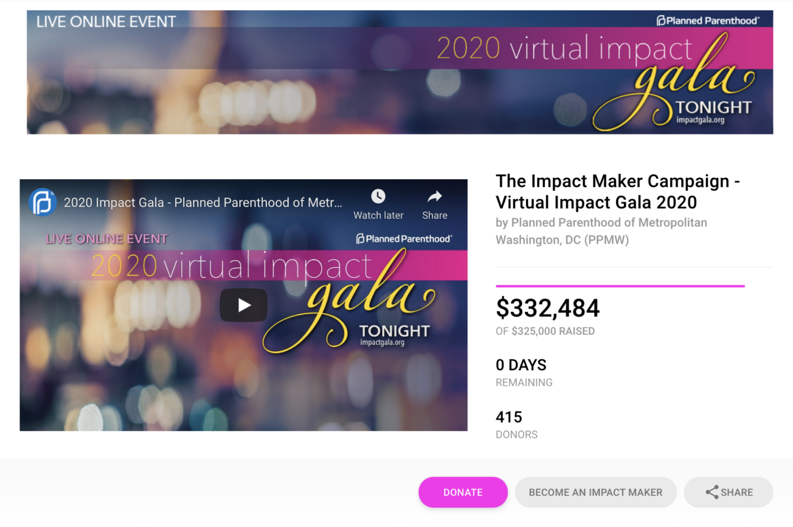
With the San Francisco Zen Center’s 2017 Zen-a-thon campaign, the “Donate Now” and “Become A Fundraiser” buttons are situated at the top of the page and bold and bright, catching visitors’ attention immediately. The aesthetic grabs your attention with well-designed graphics, and that attention is pointed directly at the two buttons—which use the organization’s brand colors.
Also prominently displayed is the fundraising progress bar, with the ultimate goal to raise $100,000. Before visitors ever get the chance to dig into the event details, incentives, fundraiser leaderboard, or FAQs, they see how much has been raised already and they’re encouraged to continue the momentum.
You’ve taken the time to map out the purpose of your design, where you’ll lead people when they land on the page, and how you want them to engage with your page. When you put out a product that hasn’t been designed well, it communicates that you don’t care how people interact with it.
The Movie Paradigm
Consider a great movie you’ve seen. It follows a structured design that takes you on a journey from start to finish. Along the way, you’re given the information needed to understand what’s happening on screen, forge emotional connections with the characters, and find closure in the resolution of the film.
Like a good movie, design your page so that it takes your supporters on a journey. Teach them about your nonprofit’s background, the problem you’re solving and the people you help, and the impact visitors make by donating.
To cite the San Francisco Zen Center again, note how they structure their campaign after the attention-grabbing header. They describe precisely what they’re fundraising for, what incentives people get for supporting the campaign, and how to participate.
From there, the page design leads visitors into a video about the organization’s mission and the people this campaign touches. Directly underneath is another central part of the design narrative: the supporters. There’s a huge photo collage of the top fundraisers who have gone above and beyond to support the campaign.
The page flows from this collage near-seamlessly into the fundraising leaderboard so visitors can explore who’s donating, how they’ve set up their fundraising pages, and how they can get involved.
To recap, the design of this page:
- Starts out bold and attention grabbing with fundraising progress and immediate calls to action to donate
- Teaches visitors about the why of the Zen-a-thon campaign and how they can participate
- Leads into a video about the mission of the San Francisco Zen Center and what impact the campaign has
- Shows the faces of the many people who have gone above and beyond to support the campaign
- Finishes on the interactive fundraising leaderboard
Every design element is added to the page with purpose. In this case, it’s to drive donations to their campaign through immediate calls to action, succinct information blocks, emotional connection to supporters, and social proof that others are participating.
BONUS: Do You Need to Hire a Designer?
If you’re considering hiring a designer for your next project, there are two major circumstances where it’s a must:
- If you want to rebrand your entire organization
- You have a major fundraising campaign that’s critical to your bottom line
If you do decide you want to hire a designer, but still don’t want to bring on an in-house team, you can always seek out freelancers. Outside of that, you may be the best candidate to fulfill your design needs with access to the proper resources.
Conclusion
Every person who comes across your website, campaign page, or donation form is going to form an opinion based purely on what they see within seven seconds . If you want your design to bring in more donations, you can’t treat design as an afterthought.
Instead, charge forward with the goal to create a highly engaging, beautiful page that grabs attention and shepherds people to convert.