Peer-to-peer events are a fun way to raise money and build relationships with your organization’s most dedicated supporters. But they’re also a ton of work! The logistics involved in even small peer-to-peer events can be staggering. Designing your event is no less important than anything else; how can you get the biggest impact while balancing design with everything else?
The answer: you focus most of your attention on 3 elements that biggest impression. Smaller design pieces can be handled later or outsourced to someone else — either way, you’ll know that the most important pieces are already handled and can attend to other details.
So where do you focus your effort?
Here are 3 elements you should include on your event page to make the biggest impact.
Pick a couple of really fantastic images
Choosing a great image that represents your event or your organization’s mission is one of the most helpful things you can do at the start of the design process.
Your image can be great material for your peer-to-peer event page. Here’s an example from one of our pages; we used an image from a past walk/run event as the starting place for our event’s design:
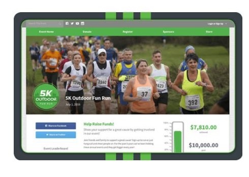
We used this picture as the event’s banner image, which means it will appear on every event page (including individual fundraisers’ pages, team pages, sponsor pages, etc.). Since it’s the most prominent image on these pages, we chose a picture with lots of movement, lots of people, and a fun color scheme. If we were a nonprofit, we’d probably work to include imagery that focused on our mission, too.
Our picture influenced our color palette for the rest of the event, as did the green color of our event logo. Throughout the event pages, we used the green color from our logo and colors from the photo to give the event a lively, welcoming, fun vibe.
A great picture can also be useful when you’re writing copy. This is especially true if you use an image that carry a lot of emotions or are directly related to your mission or the particular program your event will fund. Your image can be the center of the story you’ll tell throughout your event, in participant recruitment messages, in donor appeals and thank-yous, etc.
Be deliberate in choosing your event image! It’s got a huge amount of visibility on your event page, so it’s important to use that space wisely.
Make sure your registration and donation processes are streamlined
You know what’s the worst? Knowing that donors land on your donation form and never finish their gift. Or knowing that someone started to register for your event, then changed their mind.
You’ll never get a 100% conversion rate, but there are some steps you can take to make that rate higher.
For donation pages, you can boost your conversion rate by making your donation form as simple as possible. You can check out this donation form checklist for a complete breakdown of how to make sure your form is as user-friendly as possible, but some highlights are:
- Keep additional questions to a minimum. Instead, only ask for basic info needed to complete a transaction (name, billing info, email, etc.) and ask for other information (how they found out about you, etc.) later in a donor survey or follow-up email.
- Provide a wide range of suggested donation amounts. There’s a ton of psychological reasons behind why adding suggested donation amounts increases donation size — we could write a whole article on that alone! — but they work. Of course, you’ll always want to include the option for a donor to enter their own amount.
- Don’t remove security certificates. Consumers are increasingly aware of information security online, especially after recent large-scale leaks that compromised personal information for millions of Americans. Security certificates are, admittedly, not the cutest images… but they’re reassuring for your donors. So is the little padlock icon and the “https://” URL in your browser’s search bar. They’re small elements, but they’re important!
Your event registration process will, of course, be more complex than your standard event donation page. There’s much more information to collect, teams to join, waivers to sign, and (often) merchandise to include in their transaction. Since registering for a big event can be a longer process, event registration forms can get pretty lengthy. But people are put off by lengthy online forms.
Avoid intimidating your participants by keeping your registration process streamlined. There are plenty of ways to do this, but at Qgiv, we have each registrant focus only on one single section of the registration process at a time. For example, the process is split into these sections, each of which is minimized on the screen when the user moves to the next section:
- Type of participant (for example, whether they’re fundraising or just participating)
- Account creating (email address and password)
- Participant classification, if applicable (example: when an event has multiple locations, etc.)
- Participant category (example: whether they’re walking, running, or doing a longer race)
- Personal information and additional questions/waivers
- Optional merchandise, if the event includes merchandise
- Review and billing
That’s a ton of information to collect! But each section only includes a few fields, so the user is never overwhelmed by an extremely long form.
People will fill out forms to support you, but they’re easily put off by tons of fields. Keeping fields on donation forms to a minimum and focusing on the user experience during the registration process will help you immensely.
Include a fantastic fundraising video on your event homepage
It’s 2018, and people don’t read as much as they used to — especially on the Internet. Instead, many people prefer to watch videos!
Take time to create a powerful video for your event homepage. Explain why your supporters are participating and which programs or campaigns your event will support. You can also share a little bit about the work you do, and it’s always a great idea to tell participants and donors how their support will make a difference.
Some good elements to consider including in your video include:
- A compelling story that will make participants and donors want to get involved
- Images and information about what money raised at your event will support
- Clips and highlights from previous events, if possible
- Testimonials from clients or past participants
- A strong call to action
A study in 2013 showed that 57% of people who watched a fundraising video went on to make a donation. And, 5 years later, video is stronger than ever. You can read more about making a nonprofit video to get some ideas — a video is a great way to engage people on your event page. If you don’t have the time or resources to produce a longer video, look into short-format content like micro videos for nonprofits. They’re a fantastic tool for busy fundraisers to make a big impression with just a little effort.
What else do I need on my peer-to-peer event page?
There are all kinds of elements you can include on your page: leaderboards, thermometers, news feeds, social sharing buttons — the list goes on an on. And those things are often really, really fun, and they make raising money for your organization more enjoyable.
But the cornerstone of your event should be the story and your mission. Why should people raise money for you? And how will their support change the world?
Choosing images and video that will compel people to support to you and making it easy for them to start supporting you is key. Get those pieces in place and you’ll be well on your way to running a great event.
Is your nonprofit looking to increase your donations? Check out Elevation’s Increase Donations Guide for tons of ideas on how to make 2018 a great fundraising year!
As always if you have any questions please reach out to us! We love hearing from you!