Is your nonprofit donation page enticing visitors to click the donate button? Or is it promptly making them run for the hills, longing for the good ol’ days of writing a simple check?
Your nonprofit relies on donations. And when it comes to asking for money, you want to make it as easy as possible for people to give it to you. Elevation is here with solutions.
So what, exactly, makes a nonprofit donation page bad?
There are many factors that can make a donation page “bad,” but here are a few big ones you’ll definitely want to avoid:
- It’s complicated and difficult for donors to use.
- It makes giving harder and not easier.
- It doesn’t have a secure URL.
- It has elements that distract from the donation process.
It’s crucial to remember that the primary purpose of your online fundraising page is simple: to collect donations.
With all that in mind, how are you ever going to optimize your donation page? We’ve got a few tips that may help you out.
Security
This one is glaringly obvious. No one will want to enter their credit card number and other sensitive information onto a page that is not verified and secure. Encrypt your donation page with an SSL (or Secure Sockets Layer, also known as the “s” in https://) to ensure donors that all information will be transmitted securely and privately. Equip your page with security badges that come with your donation processor or that can be manually added to the bottom of the page, such as the “PayPal Verified” stamp.
Layout strategy
Put suggested donation amounts front-and-center. Make your forms easy, simple, and all visible on one screen. Keep it entirely “above the fold,” or on the first part of the page that appears, so as to limit the opportunity for scrolling or straying from the donation page.
Design elements
Optimize your donation page aesthetic by any web design standards. Display your logo prominently, choose a fitting color scheme, include captivating images, keep menus easily navigable, etc. Check here for some more website updates that will boost the interest factor.
Mobile responsiveness
With increasing numbers of mobile donors, the importance of a mobile responsive website is greater than ever. 84% of donation pages are not mobile optimized. Ensure that yours is part of the other 16% so you’re not losing out on these instant donations.
Thank you page
This is perhaps the most important component of your nonprofit donation page. As a nonprofit you are deeply grateful for every incoming donation, so let it show! Always thank your donors, show appreciation for their generosity, and assure them that they donated to the right cause.
Shareability
Take a cue from the crowdfunding websites and make sure your page is primed for sharing. Add an option to the end of your donation process for a donor to share the news that they donated either via email or over social media or both. It’s win-win; your donor gets to brag a little, and your donation page and organization get some good publicity.
Use this opportunity to stay in touch. Donors want to see what their contributions are going to, so share your successes on social media. Link your social media accounts at the bottom and encourage your donors to keep the conversation going. This is not just a one-time thing!
Here are some examples of the best nonprofit donation pages:
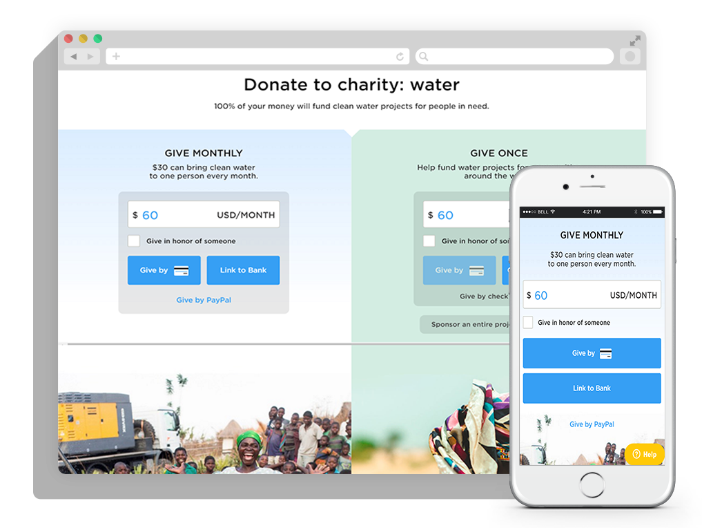
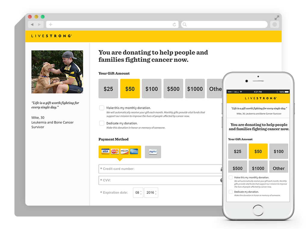
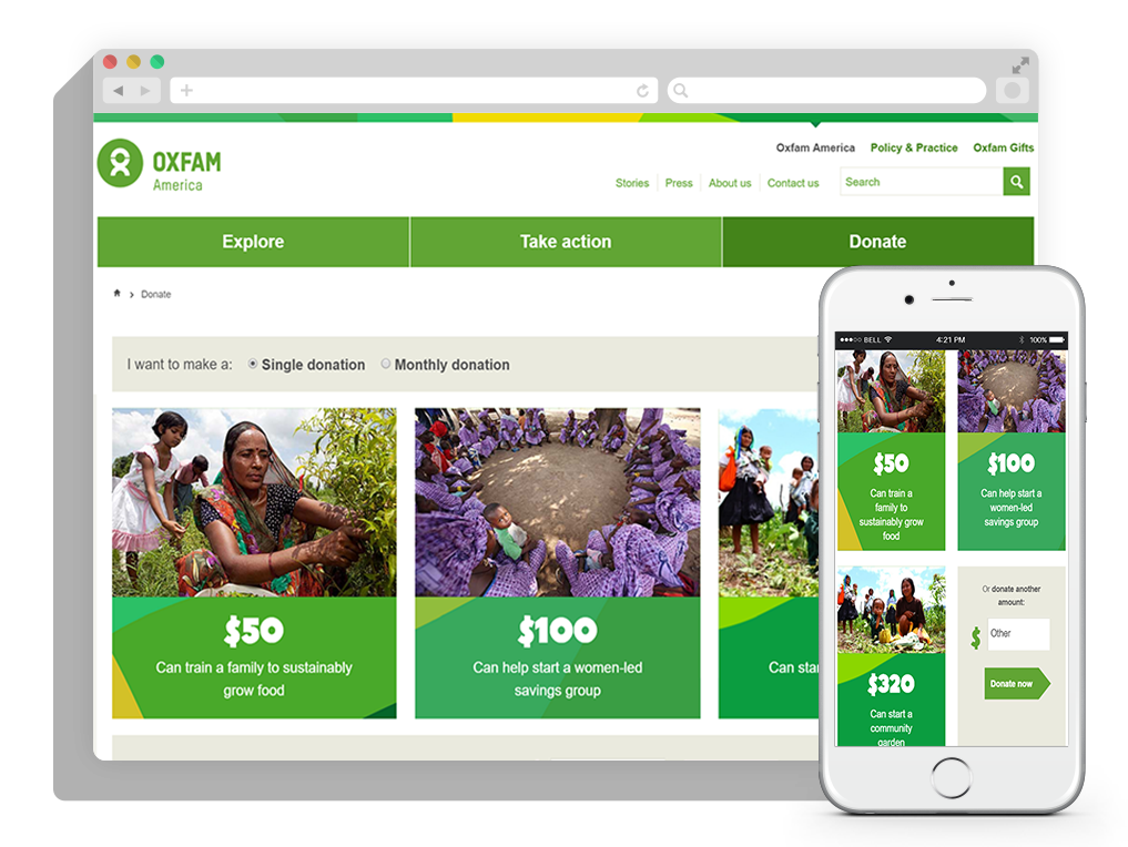
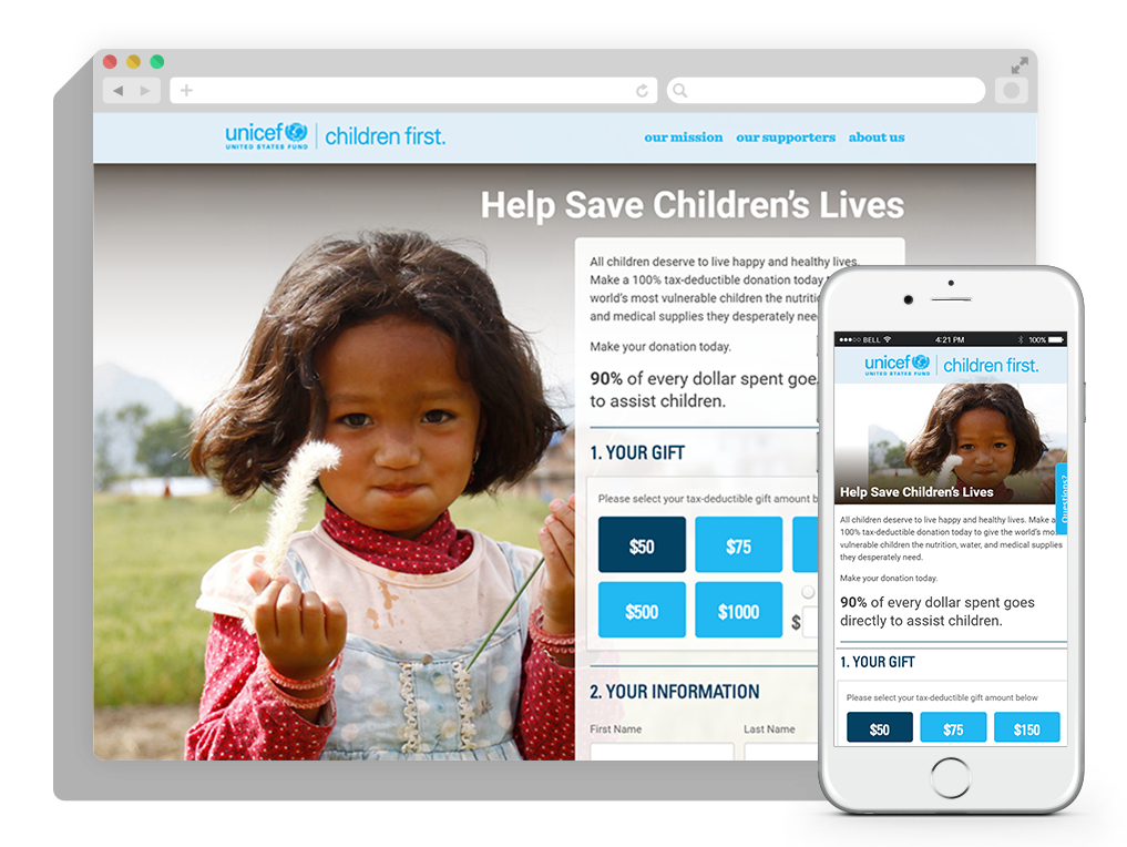
All these donation pages do an excellent job of zeroing in on the giving and streamlining the process for donors.
The bottom line:
Your donation page is at the heart of your nonprofit’s website. Alongside your mission, vision, and opportunities exists this concrete call to action. Donations keep nonprofits afloat: provide your donors the most user-friendly experience and reinforce that they made the right decision!