
It’s time to talk about the individuals who can’t use technology. Having tech skills may now be the norm but not everyone is comfortable interfacing with computers, tablets and iPhones. And while some people may still struggle with touchscreen we want to make sure they can still participate in Giving Tuesday.
It’s all about simplifying your online donation process to ensure that even the most technologically challenged are able to get from your homepage to your donation page. Follow these 8 tips to ensure that you are 100% ready for Giving Tuesday and the non-tech savvy.
Large and clear Text
Many of your non-tech savvy donors may be, and reading on a computer screen isn’t always easy to begin when older. If your text is small then they are going to be squinting at their computer screen and end up struggling to give you their gift.
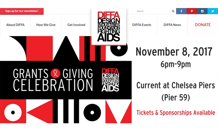
The Design Industries Foundation Fighting AIDS utilizes clear bold text so that their site is easily readable. The donate button is easily found in the upper right corner boasting all-caps to ensure it won’t be missed.
Easily Accessible from Homepage
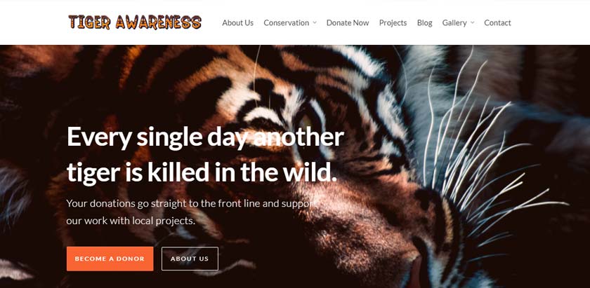
Give your non-tech savvy donors at least two different donation options right off the bat. Tiger Awareness gives potential donors both a “become a donor” option (right in the middle of the homepage) and the standard “donate” button in the right corner. Your site visitor is given two different donation options right of the bat which simplifies the process for the non tech savvy.
In addition, Tiger Awareness varies the language used to ask for donation. By using different vocabulary they are able to appeal to donors twice without coming off as overbearing or pushy.
Include Two Donate Buttons
Those of us who frequent nonprofit websites are used to the donate button generally appearing in the upper right corner.
Your new non-tech savvy donors are different. They require additional information about your organization both because they need a reason to make a donation and they are less likely to trust information online.
First, always have your upper right-hand donate button for regulars and younger donors. During the high traffic period during the end of the year from Giving Tuesday until after Christmas, add another donate option in the middle of your homepage.
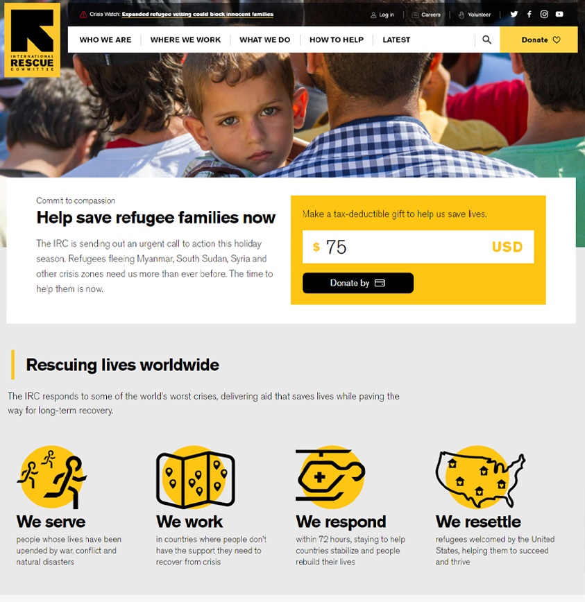
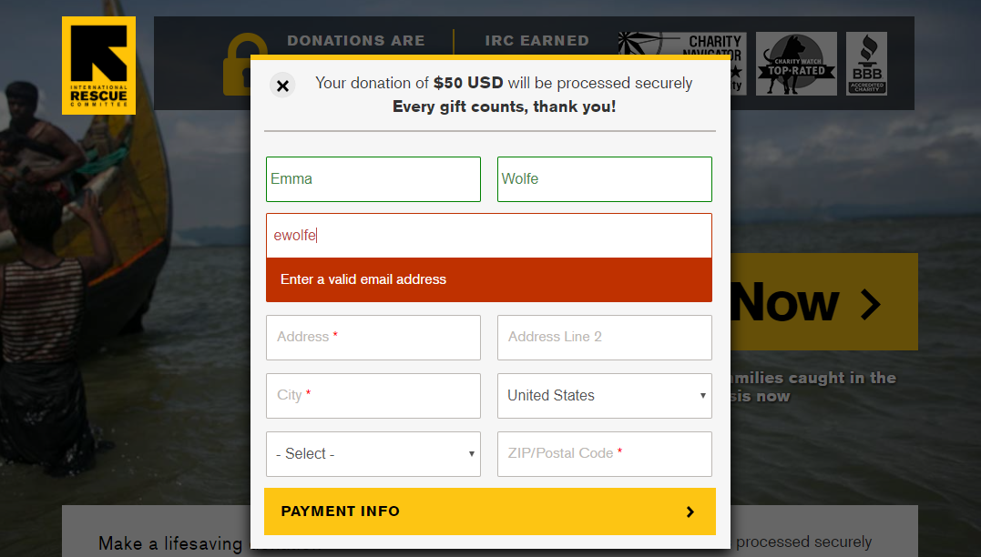
Looking at International Rescue Committee’s (IRC) homepage above you see two donate buttons. Next to the donate button in the center of the homepage is a small pitch with information about the organization and what it does. Someone who is donating for the first time is given both the information they need and easy access to donation.
Give a Specific Donation Amount

Simplification is the name of the game so give your donors a pre-specified amount to donate. Start low (maybe $25) and work your way up. Make sure it’s easy for your donors to just click the chosen donation amount and then progress quickly to the payment page.
Show where the money is going
You’re almost there. They’ve clicked “donate now” but you could lose them if it’s unclear where their money is going. After someone has clicked on the “donate” button and been redirected to a page where they pick their desired donation amount, make sure they are clear on exactly what their money is funding.
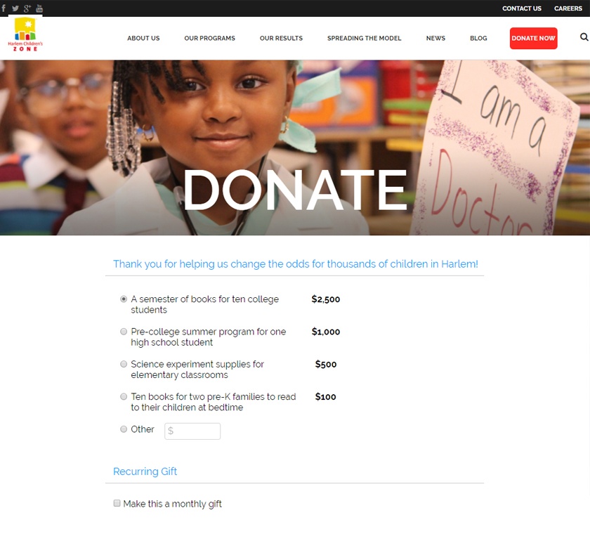
Harlem Children’s Zone does an excellent job of this. Each donation amount is linked to a tangible result. Your non-tech savvy donor will feel more at ease and more likely to complete the donation process knowing how they’ve made an impact.
Add Prompts
Your less tech-savvy donors need to be reassured that they are completing everything correctly and they are much more comfortable when they can follow written instructions.
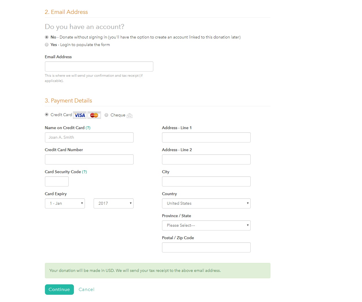
World Housing’s donation page asks a series of questions to guide the process. In section 2, the page asks “Do you have an account” with the options of “yes” or “no”. There is a brief explanation of each answer. Details like this will go a long way in easing the worries of your technologically challenged donors.
Validation/error color response
People like to know that they are completing tasks correctly. Your non-tech savvy donors are no different. By including green fields that appear when a donor has filled something out correctly and red when they have not, you are able to help your donors out without being there.
When you fill out a field correctly on IRC’s donate form, it turns green indicating it has been done so correctly. When you have either not finished filling a field out or filled a field out incorrectly, both a red box and error message appear.
Stress Donation Security
At the beginning, in the middle and at the end stress that the donation is completely secure. You can use both written language and security seals to do so.
These donors are not used to technology and may not trust it. By constantly reaffirming that their donation is safe will go a long way ensuring that they complete the donation!
Check out Mentoring Project’s security seals above!
Conclusion
As technology usage becomes more widespread, we tend to forget that there are still people out there who aren’t the most comfortable with it. Make it your priority this Giving Tuesday to make donating easy for all of them so everyone is able to give to the causes they care about!