What’s the first thing you see when you are browsing online and enter into a nonprofit website? A powerful image? An inspiring slogan or tagline?
What’s the next thing you probably do? You will most likely scroll down to see more of the website. In that case, you will probably notice that the website header is visible no matter how far down you have scrolled on the page.
“The purpose of your website header is to promote your brand and make your site instantly recognizable to those who are already familiar with you.”
In fact, your header is going to be where your visitors look to in order to find any initial important information about your organization. Not only will you showcase your nonprofit logo in your header, but there are many different elements that compose your header’s sitemap.
Your header is going to go across almost every page of your site (with some exceptions), so you should make sure that it displays all the information that you deem important for your visitor to be able to easily access.
Remember that no website is alike and every organization needs unique features or widgets. In this post, we have compiled a list of 15 different elements that you typically find on different types of nonprofit website headers.
Logo
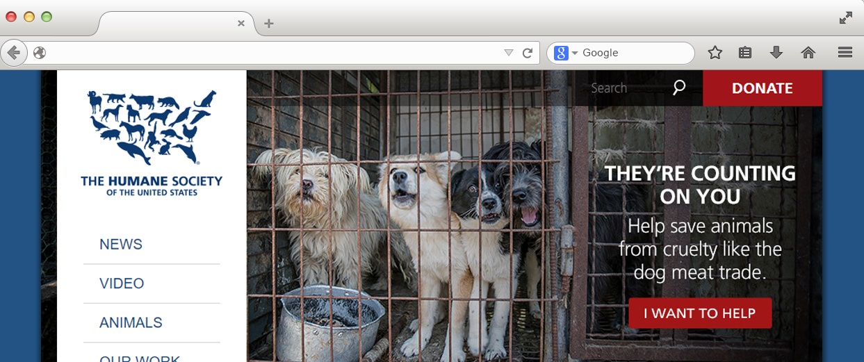
We at Elevation firmly believe that your nonprofit should have a great logo. Nonprofits need great imagery and well thought-out design bundled up in a small icon to represent their organization, and this icon is almost always displayed at the top left-hand side of your website header and typically acts as the Home button when you click on it. The Humane Society does a good job of boldly displaying their logo at the top of their Main Menu. If you want more inspiration on nonprofit logos, check out our Best 75 Nonprofit Logos page here.
About
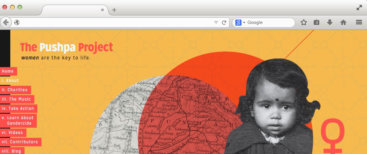
Another essential element that you should include on your nonprofit website header is your About section. Your website visitors obviously need to know who you are and what your organization is all about in order to think about getting involved. The Pushpa Project has an interesting left-hand menu that allows you to easily find out more about the project by locating their About tab near the top of their Main Menu.
Our Work
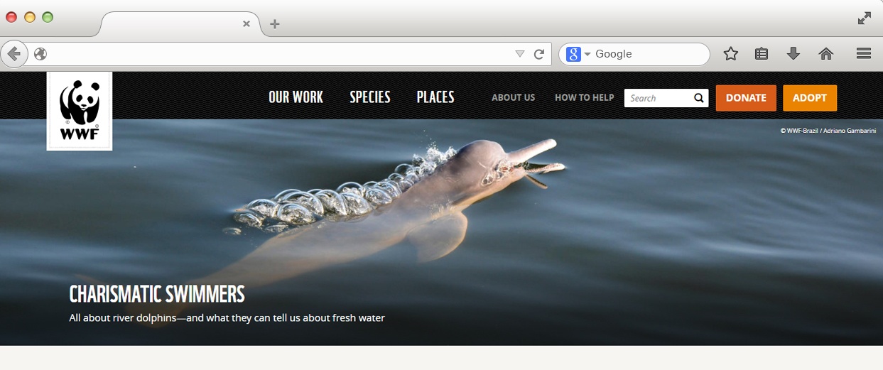
Now that your audience knows a little more about you, they should also be able to find out what impact have you had in the world. Are you using real numbers to convey that impact? Are you putting your good work out there for everyone to see? WWF, for example, includes their work as an important aspect of their header. This is because WWF deals with a vast amount global issues including climate, food, oceans, etc. which deserves their own interior page in order to educate those who are interested in their cause.
News/Blog
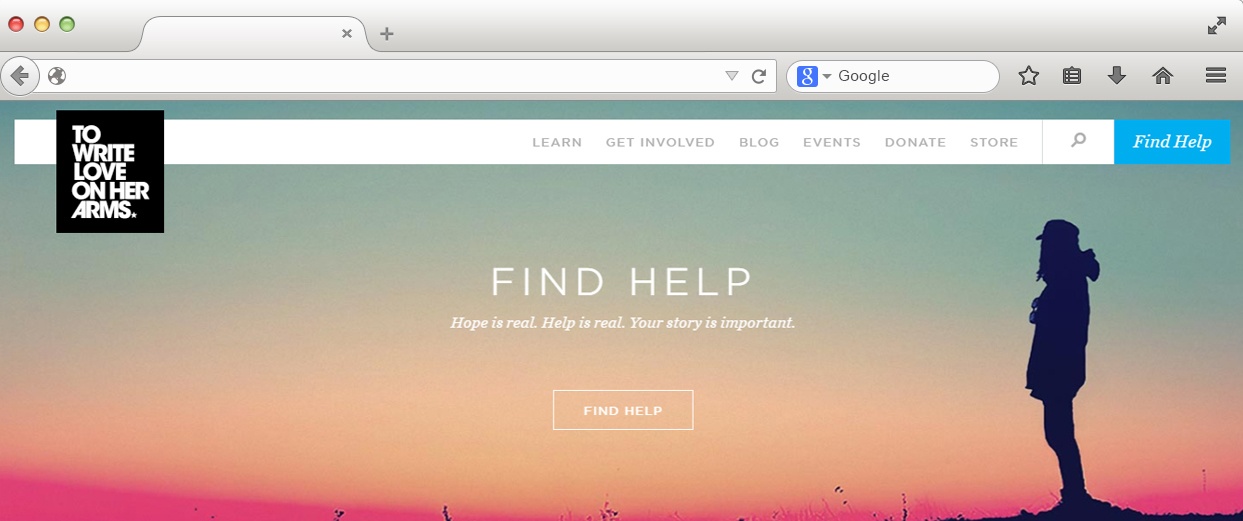
Another common feature to find on your website header is a Blog or News section. This section allows you to post updates or share articles on relevant topics in your industry. A great example of a nonprofit blog is To Write Love On Her Arms‘s blog. They also clearly display a link to their blog on their website header, as seen below.
Donate | Get Involved/Volunteer | Fundraise Buttons
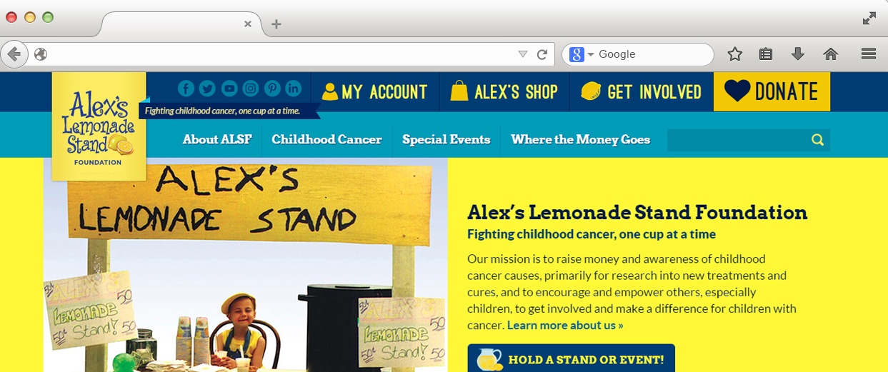
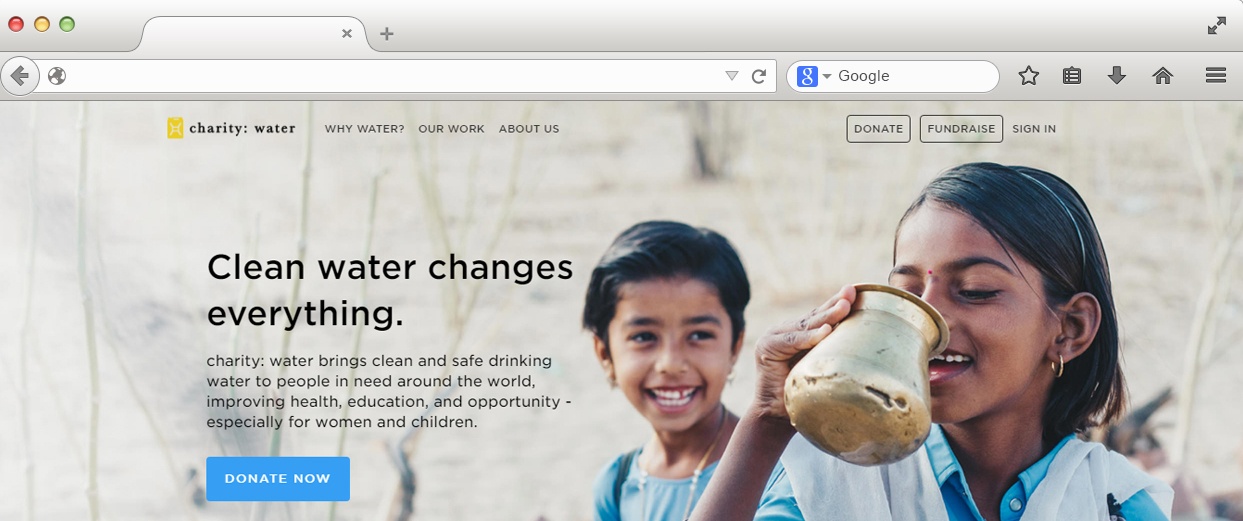
There’s no doubt that your nonprofit’s website needs Calls to Action (CTAs) that stand out from the rest of your page. Where is the best place for your CTAs? In your header, of course! First and foremost, your organization is most likely going to need a donate button. Keep in mind that this button is usually displayed regardless of the interior page your visitors navigate to – so make sure that it stands out! We have included two examples of nonprofit website headers below. The first, Alex’s Lemonade Stand, displays a bright Donate button on the right, as well as a Get Involved button right next to it. If getting involved is a main priority for your organization, you should include it or a “Volunteer” button in your header. Another option that some nonprofit’s choose to include is a Fundraise CTA, as you can see on charity:water’s website header.
Social Media Icons
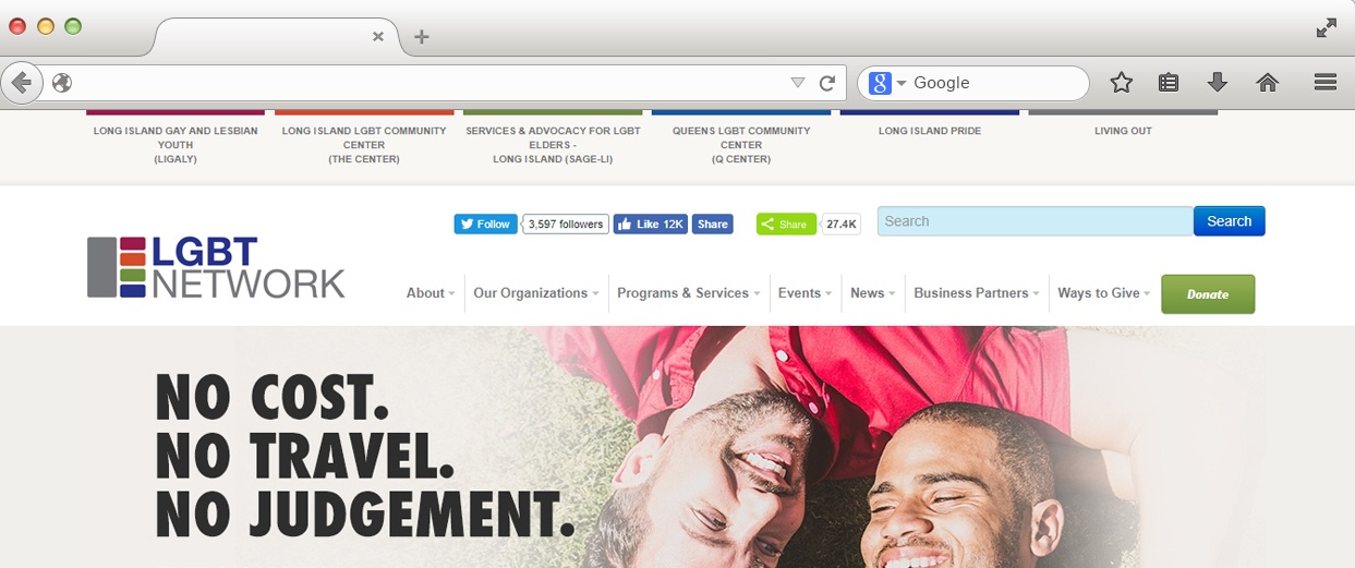
In today’s world, social media is such a vital part of any type of organization or company. It is a tool that you can use to communicate news, updates, events, photos, videos, new products, and more. Websites typically display social media icons on the header or footer, depending on the importance of the role social media has for your nonprofit or how busy you want your header to look. Although most organization simply display their social media icons, we found The LGBT Network’s social media buttons to be interesting as they display actual follower and like information.
Events | Contact Us
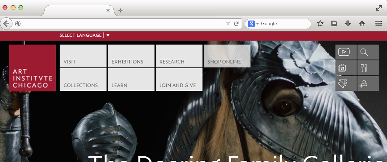
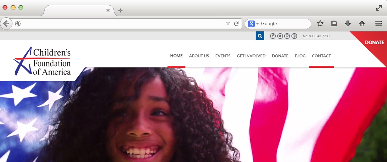
Does your nonprofit host many events? If you’re a museum like the Art Institute of Chicago, you probably have an events page that needs constant updating. Whatever type of organization you might have, if events are a priority for you, be sure to include a Calendar or Events tab on your header. The Art Institute of Chicago has a unique header and includes a separate mini navigation menu on the right-hand side where you can find an icon clearly displaying their Events Calendar. The Children’s Foundation of America also has an Events tab, but we like how they also include their contact information on their header, which gives their visitors easy access to their phone number, email, address, etc.
Partners/Donors
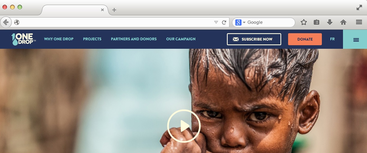
Add a tab for your nonprofit’s partners or donors if you believe it to be an important facet of your organization. One Drop includes a tab for Partners and Donors where they include a list of their corporate partners like Cirque du Soleil and Microsoft as well as information about the value of their partnerships and donor relationships.
Store
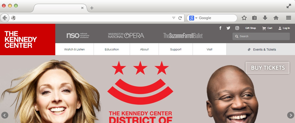
Does your nonprofit sell merchandise? If so, consider putting it in your website header. The Kennedy Center not only has a link for their Gift Shop in their header, but it includes also a handy link for your Cart. They sell a variety of apparel, books, music, toys, and more in their store so it is important that they highlight these features at the top of their website.
Language | Search Box
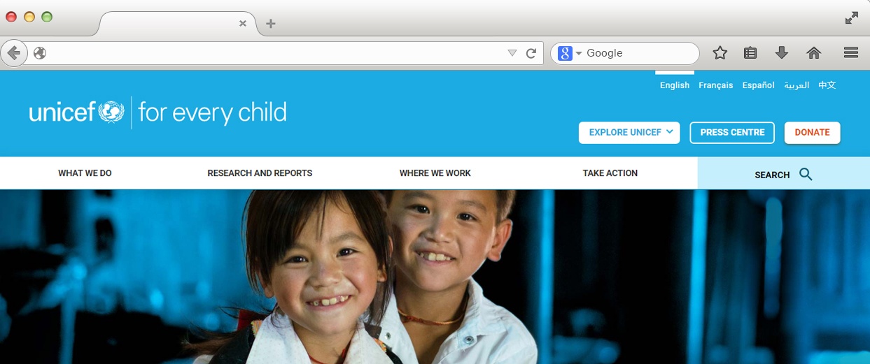
If you organization is international and deals with many different countries, it’s a good idea to have the option to view your website in different languages as Unicef does, who offers their website to be viewed in English, French, Spanish, Arabic, and Chinese. Also, be sure to include a Search option so that your visitors can easily find what they are looking for on your site.
Membership Administrator
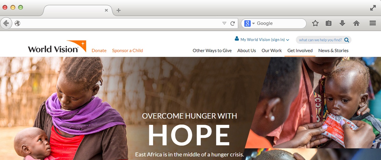
It’s common for nonprofits to have a separate site for the members of their community in order for them to access their own personal information related to the nonprofit. For example, World Vision’s membership website gives members access to their giving record, communication with sponsored children, or any notifications they might need to see. If you have a membership site separate from your normal website, you will need a Sign In link on your header. You can see in the example below how World Vision calls their member site “My World Vision.”
Mission Statement
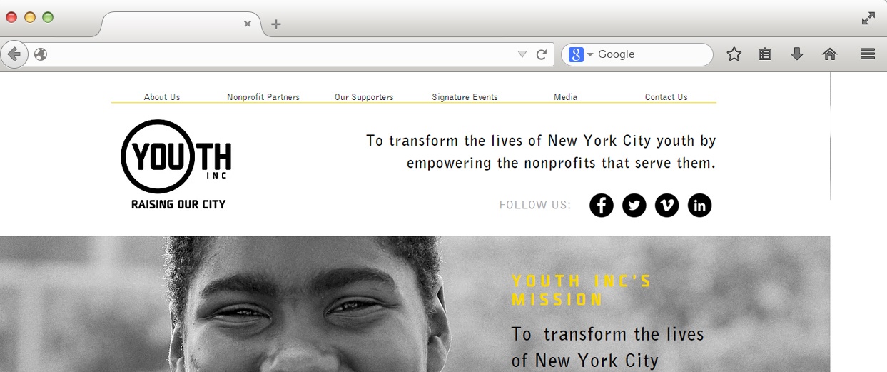
Mission statements are at the direct center of nonprofits. They are bare-bones proclamations of why your organization exists. Although it’s not necessary to put your mission statement in your header, it’s definitely an option that you can consider! We like how Youth Inc. puts their mission statement on their header because it shows their website visitors exactly what their organization does when you enter their page. If you want more mission statement inspiration, you can always check out our 30 favorite nonprofit mission statement examples.
Subscribe to Newsletter
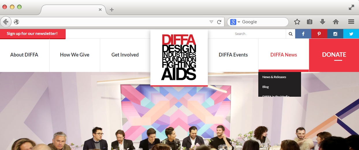
Is your newsletter a major player to give updates or spread news for your nonprofit? Add an option to sign up in your header, just as DIFFA does on the upper left-hand side of their website.
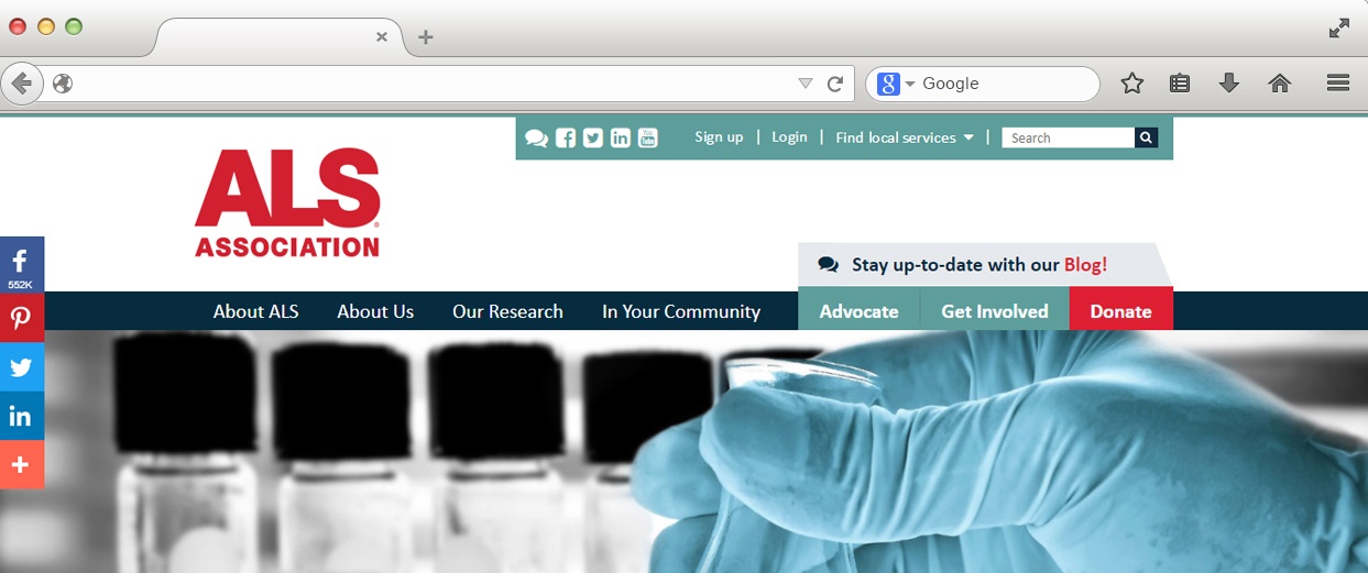
Research
Many nonprofits, especially healthcare-related, are centered around research. If this is a major facet of your organization, you should include a Research tab on your website header. You can see an example below by The ALS Association.
Careers
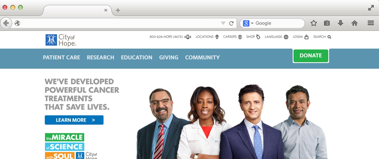
City of Hope is another healthcare nonprofit that includes a tab for their research. However, what we also liked about their header is that they add a Careers section in the upper navigation bar of their header. Although most nonprofits would add this section in the footer, it’s good to add it to your header if you provide many employment opportunities and would like to highlight them.
At the end of the day, the important thing to know when choosing what to put in your nonprofit website header is that it all depends on the needs of your particular organization. Think about the different information that you want your visitors to be able to access easily, especially if it’s the first time on your site, and put it in your header. Feel free to comment below or reach out to us at Elevation with any questions you have about nonprofit website design and user experience. We’d love to hear from you!
In addition, if this blog has insipired you and you are now considering a website redesign click the link below to download our free checklist: “8 Things You Need to Know Before Starting your New Website.”